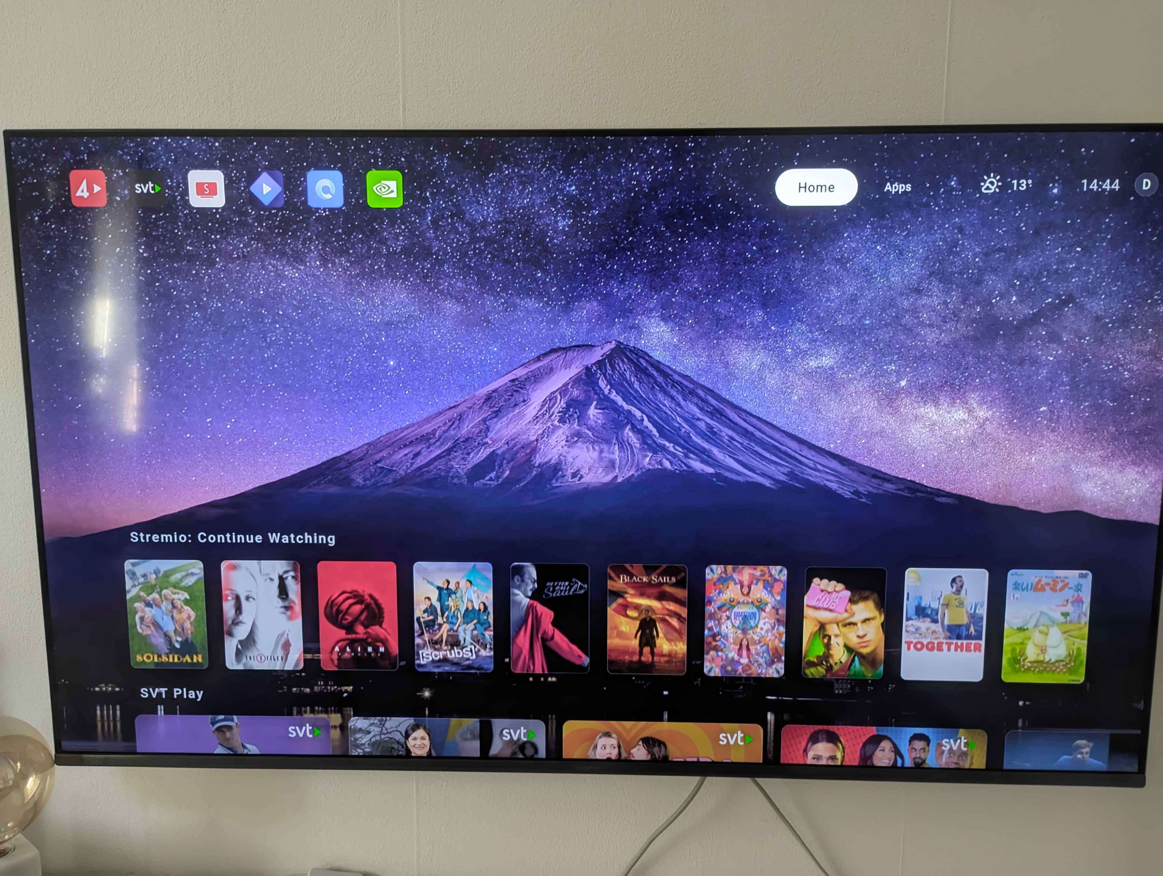
Option to have a more simple "Home" tab
I would like a future option with the ability to customize the "Home" tab into something more simple.
As a Chromecast (CCWGTV) user, scrolling up and down is a bit too slow.
Also as a non-plex user, when switching between the app channel feeds the background color change is not quick enough, which makes it look weird.
It would be great also, to be able to see more feeds at once.
Could have a classic/simple option, and default option for feeds.
Something similar to this, just simple rows of each app:
Log in to comment and vote
Comments1
Frankz
Apr 15, 2025
Came here for this suggestion. I love all the customizations available, the only thing i personally miss is a simple compact row based Home screen.
Currently the Home screen rows take up a lot of screen percentage wise. Navigating to see everything takes a lot longer because of this design.
So a condensed/compact row view that shows multiple rows would be great for faster navigation and overview.
In a way it would look like what the current Android tv home screen looks like, but without the giant ad that takes up half the screen.
Edit: pressing the back button on the Home tab brings up the condensed row view. It would be great to be able to set this as a default view for Home